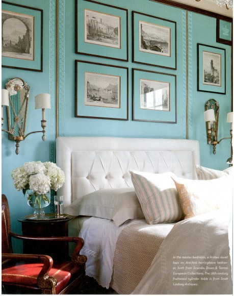
I tore this page from the February issue of Spaces magazine. This room is too formal for my lifestyle and taste, but that color. Ohhhhhhh, that saturated color.
 I think the turquoise matted framed art is brilliant. And, if you look closely the whole wall is framed in wood and acts like a giant second headboard. Again, brilliant. Because that incredible color would become cloying if the whole room was saturated. To me it is the perfect amount of infused color.


I liked this room very much when I saw it. I can’t pinpoint exactly how it made me feel but I kept thinking about how silkscreened paper feels – milky and rich.